academic publishing
27 designs
Showing 24 of 27 (27 total)

This spread features a clean, professional presentation of quantitative data using large circular charts against a stark white background. The design emphasizes clarity and readability, utilizing a monochromatic palette of purples and whites to create a modern and analytical feel.

This design utilizes a stark, minimalist approach, pairing a deep green background with light purple typography to create a clean yet academic visual. The vertical stacking of terms emphasizes structure and list-based information, resulting in a highly organized and somewhat clinical aesthetic.

This design showcases a highly structured, minimalist presentation grid system characterized by precise lines and ample negative space. The visual language is strictly functional, prioritizing the clear organization of textual information within defined cells for academic or professional use.

This design utilizes a modular, collage-like layout characterized by strong color blocking and varied text treatments to present dense editorial content. The visual language is modern and academic, relying on high contrast between dark backgrounds and vibrant accent colors to segment information effectively.

This image displays a stark, minimalist data presentation, likely from a report or book, characterized by high contrast and clean typography. The design prioritizes the clear, quantitative display of severe statistics, lending it an objective and serious tone.

The image presents a clean, academic, and highly structured layout typical of a report or textbook. It uses a minimalist design with distinct color blocking to separate different sections, conveying a sense of serious, in-depth research.

A minimalist editorial layout featuring two-column design with architectural and documentary photography paired with Spanish-language text. The design employs a clean, academic aesthetic with stark black borders and institutional typography, creating a serious, contemplative visual narrative around urban spaces and memory.

A contemporary editorial layout with a bold pink background exploring economic globalization and global connectivity. The design employs a multi-column grid structure combining typography, photography, and data visualization to present complex socioeconomic themes in an accessible, magazine-style format.

A sophisticated editorial layout exploring philosophical themes through dramatic imagery and refined typography. The design employs a minimalist grid system with generous whitespace, pairing an evocative abstract photograph with serif typography to create an intellectually engaging visual narrative about life and death.

A contemporary design system for an exhibition or publication titled 'Ruumi-Mõju: Impact of Space,' featuring a modular grid-based layout with bold geometric blocks. The design employs a striking contrast between vibrant cobalt blue and warm cream tones, accented with metallic gold elements, creating a sophisticated and intellectually rigorous visual language.

A modernist design combining dramatic black-and-white geometric abstraction with dense typographic elements. The composition features a radiant starburst pattern with sharp angular forms and gradient transitions, paired with small-scale text arranged in organic clusters below. The overall aesthetic is distinctly Swiss Style with experimental, avant-garde sensibilities.

The image presents a stark, text-heavy layout typical of an academic or artistic portfolio, utilizing ample white space to emphasize dense blocks of prose. The design feels serious, intellectual, and minimalist, relying on typography and negative space to structure the information.

The image presents a clean, academic, and professional layout typical of an explanatory report or presentation slide. It uses a high-contrast, minimalist design with clear segmentation between the title section and the content examples.

The image presents a timeline-based visual narrative using minimalist, monochromatic design elements. It employs a clean, linear structure to chart historical or chronological progression through discrete, card-like data points.

The image displays a series of stacked, bracketed text samples, likely demonstrating phonetic or linguistic representations. The design is highly structured, minimalist, and academic in its presentation of textual variations.

The image presents a stark, minimalist index or archive page with a clean, academic layout. It uses ample white space to separate chronological entries and photographic examples, conveying a sense of curated historical documentation.

This image presents a dense, collage-like typographic composition characterized by stark contrasts between solid blocks of color and densely packed, often fragmented text. The design feels experimental, academic, and highly textural, utilizing negative space and overlapping elements to create visual tension.

This image presents a dense, layered typographic collage characterized by stark contrasts between dark and light tones. The design feels experimental, academic, and highly textural, utilizing varied weights and alignments to create visual tension.
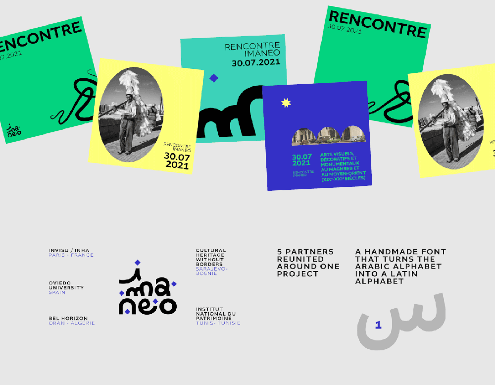
The design utilizes a vibrant yet clean color palette, employing solid blocks of green and yellow to create a modern, approachable visual hierarchy. It successfully blends graphic typography with illustrative imagery, suggesting an invitation to cultural or academic events.

The design utilizes a clean, minimalist layout typical of academic or professional publishing platforms, emphasizing readability and clear hierarchy. The visual language is highly structured, relying on ample white space and subtle grayscale elements to focus the user purely on the content.

This design employs a stark, academic visual language centered around philosophical concepts. It uses negative space and balanced typography combined with a dramatic, figurative element—the eyes—to frame the intellectual content. The overall feel is serious, critical, and deeply introspective.

The design employs a clean, minimalist aesthetic characterized by strong grid lines and ample white space to organize complex information. The visual language is highly structured, prioritizing readability and clear hierarchical organization over decorative elements.

This design utilizes a minimalist and highly structured approach, emphasizing clarity and professional organization through ample white space. The visual language is purely functional, relying on strong typographic hierarchy to guide the reader through technical information efficiently.

This design utilizes a stark, minimalist aesthetic characterized by high contrast between black and white elements. The visual language is purely geometric, relying on clean shapes and precise placement to convey technical or scientific information.