charity
10 designs
Showing 10 of 10 (10 total)

This design utilizes a clean, minimalist aesthetic with a grid layout to present various calls to action or informational points. The visual language relies heavily on simple line art icons set against a deep blue background, creating a professional and earnest feel.

This design utilizes a clean, minimalist approach with bold geometric shapes to convey institutional trust and hope. The visual language relies on solid color blocking and simple forms to create a strong, recognizable brand identity.

This design employs a clean, minimalist aesthetic using an earthy color palette to convey trust and professionalism. The visual language is soft yet structured, effectively pairing high-quality photography with clear statistical data to build credibility.

This design utilizes a striking juxtaposition of clean, modern typography with organic photographic elements, creating a layered and personal visual narrative. The integration of human forms into the text suggests themes of legacy, community, and individual contribution. The overall feel is sophisticated yet deeply human and artistic.

The image features a clean, professional logo mark combining clear typography with a simple, geometric icon. The design relies on strong negative space and high contrast to convey trust and established authority.
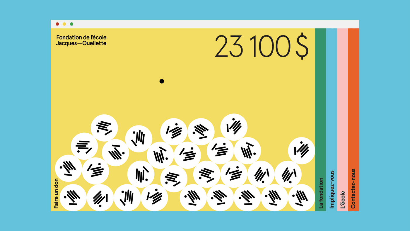
The design is clean, minimalist, and uses a bright yellow background contrasted with muted vertical stripes on the right edge. It employs a pattern of white circles containing black lines to represent contributions, suggesting a transparent and organized fundraising or donation interface.

The logo features a stylized, abstract representation of a figure or form integrated with the text 'Mellon Foundation'. The design uses a monochromatic, high-contrast approach with organic, curved shapes that suggest movement or connection.

The image displays a clean, modern mobile application interface design, characterized by a light, airy aesthetic and high-quality photography. The layout is minimalist, focusing on clear hierarchy between text and imagery to convey a professional and trustworthy message.

The design utilizes a clean, modern aesthetic with deep greens to convey trust and environmental focus. The visual language is structured and information-driven, using ample white space and clear sectional divisions to guide the user through important conservation statistics. The overall feel is professional, hopeful, and serious regarding environmental loss.

This design utilizes a modern, geometric layout with bold color blocking and a grid structure to announce an event. The visual language is clean and structured, using high contrast between muted purple and vibrant lime green to create an engaging and contemporary feel.