data reporting
44 designs
Showing 24 of 44 (44 total)

This design utilizes a dark, modular aesthetic to present various analytical tools or services. The visual language is clean and modern, relying on distinct blocks of color to differentiate functional modules while maintaining a consistent starburst icon motif.

This is a data visualization presenting monthly inflation rates for used cars and trucks, adjusted for the prior month, spanning from January to September. The design uses a simple bar chart format with distinct color coding for different data series.

This is a highly functional and modern data visualization dashboard utilizing a dark theme to emphasize bright, contrasting metrics. The design successfully uses color blocking and large typography to present complex quantitative information in an easily digestible format for quick analysis.

This design utilizes a clean, modern aesthetic to present statistical data and social commentary through bold geometric shapes and contrasting colors. The visual language is assertive and direct, effectively using upward-pointing arrows to symbolize growth or advocacy.

This presentation utilizes a stark, high-contrast design characterized by ample negative space and clear segmentation. The visual language is highly functional, prioritizing the immediate readability of statistical data through bold typography and strategic use of accent colors.

This design utilizes a clean, dark mode aesthetic to present complex environmental data in an accessible and professional manner. The visual language is minimalist, relying on strong typography and clear percentage callouts to convey important statistics effectively. The overall feel is serious, informative, and trustworthy.

This set of mockups showcases a modern, high-contrast user interface design utilizing dark mode principles to present social impact data. The visual language is clean and professional, relying on clear typography and subtle imagery to convey serious information effectively. The overall feel is grounded, transparent, and focused on measurable outcomes.

This graphic employs a clean, blocky design to present quantitative data related to urban mobility and CO2 emissions. The visual language is minimalist and relies on strong color blocking and clear typography to organize complex information effectively.

This is a line chart displaying fluctuating data points over time, characterized by a stark, minimalist design focused purely on the visual representation of the trend. The chart uses high contrast between the black data line and the light background to emphasize volatility in the measured values.

This is a data visualization using proportional circle sizes to represent monetary amounts spent by different countries. The design is clean, modern, and relies heavily on color variation to convey magnitude, creating a clear comparative chart.

This image presents a minimalist, data-visualization style graphic featuring a sequence of colored circles arranged in an arc. The design is clean and focused, using color variation to denote discrete data points or steps in a progression.

The image presents a clean, minimalist infographic style using a muted, earthy color palette contrasted with stark white and soft pink accents. The design is highly structured, focusing on presenting large numerical data points related to sports participation in a clear, modern way.
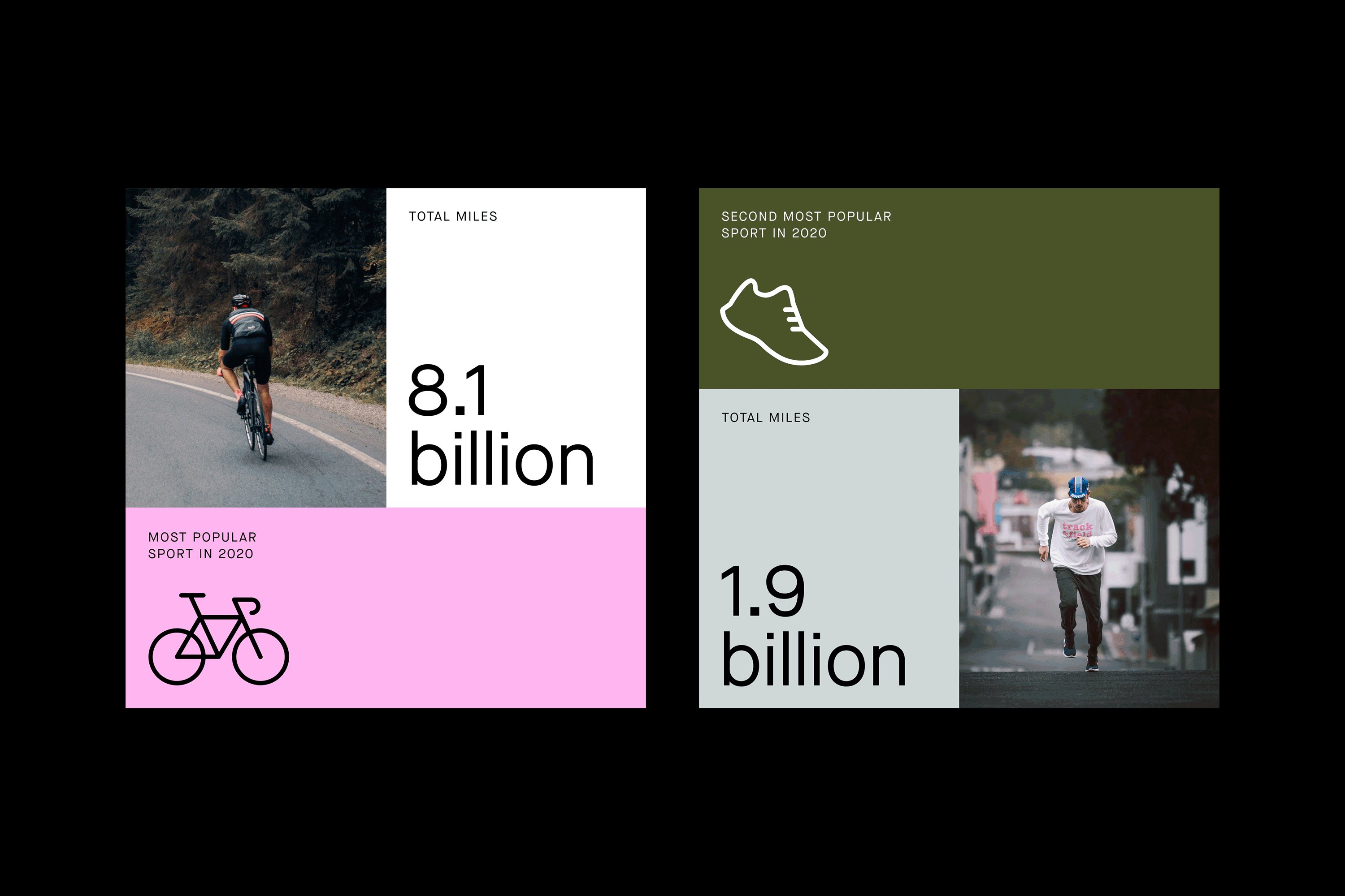
The image presents a clean, minimalist infographic style comparing large numerical data points related to sports participation. It uses a stark contrast between white space and muted, earthy tones to emphasize the statistics.

A modern mobile UI design system showcasing statistical data visualization across four smartphone screens with a clean, minimalist aesthetic. The design employs a bold color contrast strategy with vibrant orange accents against neutral backgrounds, presenting information hierarchy through typography and visual elements. The interface demonstrates contemporary mobile design principles with rounded corners, ample whitespace, and data-driven storytelling.

A bold, data-driven dashboard interface with a vibrant yellow background showcasing engagement metrics and percentage increases. The design employs high-contrast black typography and geometric elements to emphasize key performance indicators, creating an energetic and modern analytical tool.

A clean, data-driven infographic displaying sports participation statistics with a bold, modern aesthetic. The design uses a horizontal stacked bar chart with icon-based category labels and percentage breakdowns, employing Strava's signature orange branding alongside a neutral grayscale palette.

The design utilizes a stark, high-contrast monochrome palette with a pixelated or mosaic texture overlaid on a dark background. The layout is minimalist, focusing attention on the central text and the scattered visual elements which suggest a map or data visualization. The overall feel is serious, technical, and somewhat abstract.

The image displays a set of infographic cards, likely presenting data or progress reports related to global health or vaccination efforts. The design is clean, modern, and utilizes strong color blocking to highlight key statistics.

This image presents a minimalist, data-driven design focused on presenting temperature information in a vertical, graphic format. The visual language is clean, stark, and relies heavily on typography and negative space to convey precise information with a sophisticated, modern aesthetic.

The chart presents a clean, dark-themed data visualization with a strong emphasis on a green line graph against a dark background. The design is modern and functional, prioritizing data clarity through simple axis labeling and clear segmentation.

This image presents a clean, minimalist interface design, likely representing a timeline or progress tracker across different weeks. The visual language relies on solid blocks of color and negative space to convey discrete data points clearly and functionally.

The image presents a dashboard or report style with a clean, data-heavy layout using a limited palette of teal/green and white. The design prioritizes readability and the clear presentation of quantitative data through various chart types, suggesting a professional analytical tool.

This image presents a series of stark, data-driven graphic design layouts characterized by bold geometric shapes and high-contrast color blocking. The visual language is modern, minimalist, and focused entirely on conveying quantitative information through strong graphical elements.

This is a data visualization presenting genre popularity using stacked bar or segmented area charts, characterized by bold color blocks and clear percentage labels. The design is modern, clean, and focused entirely on conveying statistical information effectively.