event
18 designs
Showing 18 of 18 (18 total)

This design utilizes high contrast between stark white text and a deep, dark background, accented by soft purple circular lines. The visual language is clean and modern, suggesting a professional or futuristic theme suitable for scheduling or announcement graphics.

This image captures a modern, high-contrast presentation setup, utilizing vibrant digital light to draw focus. The visual language is clean and corporate, emphasizing information delivery through large-scale screen display against a dark environment.

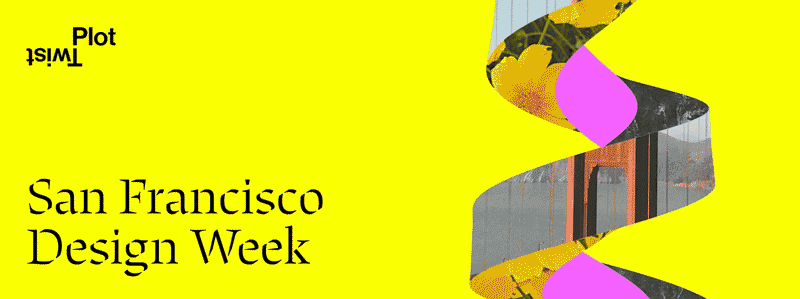
This design utilizes a high-contrast, minimalist approach, pairing vibrant pink and yellow tones to create an energetic and modern aesthetic. The composition relies heavily on large, bold typography set against a clean background to ensure immediate visual impact.

The design features a bold, serif typeface for the main name contrasted with a smaller, elegant serif for the descriptive text. The layout is centered and hierarchical, using negative space effectively to separate the elements clearly.

The image presents a modern, abstract graphic design featuring overlapping geometric shapes in a muted, sophisticated color palette. The composition is dynamic due to the varied sizes and solid blocks of color, suggesting a theme related to design collaboration or a specific event.

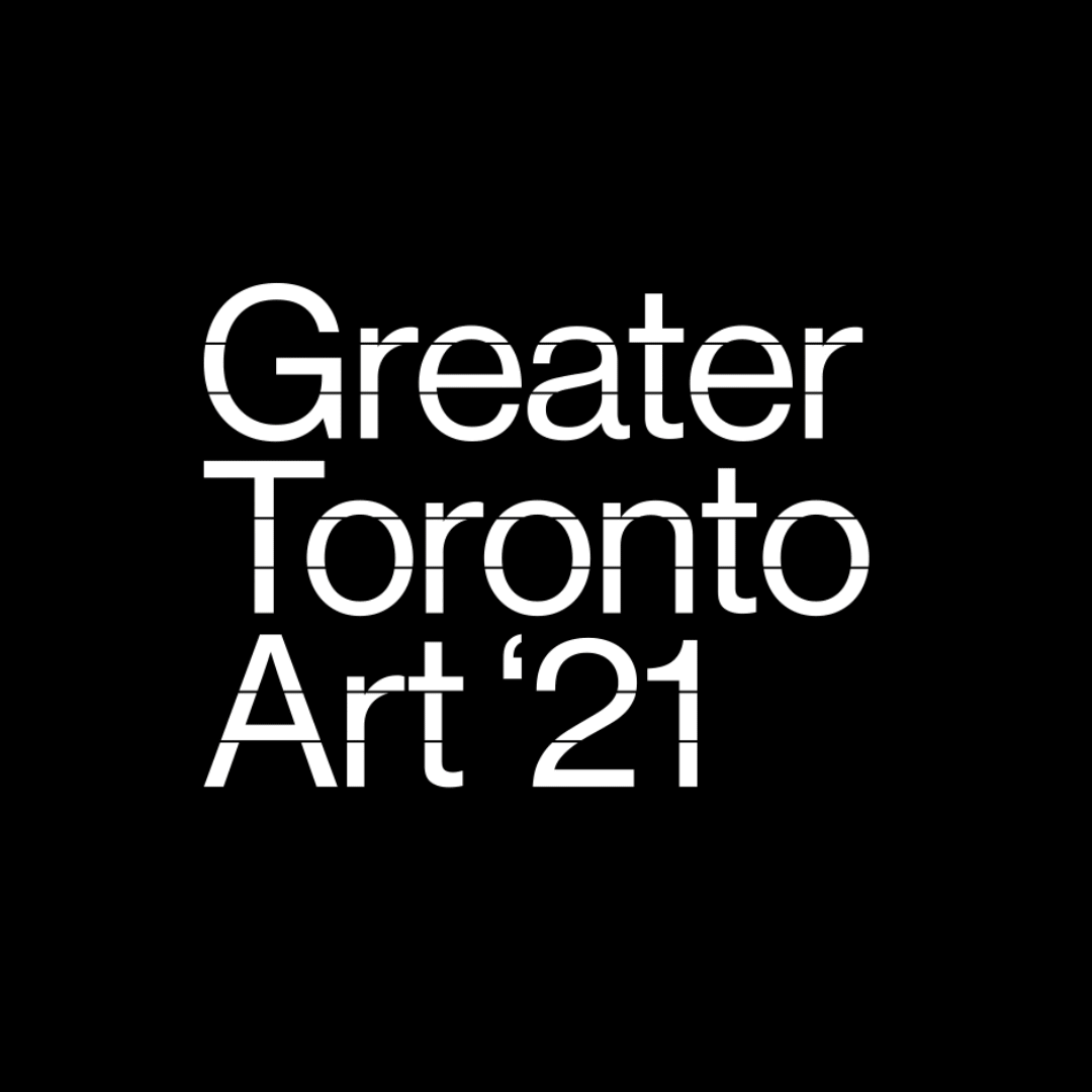
This is a stark, minimalist typographic design featuring the text 'Greater Toronto Art '21' rendered in a bold, sans-serif typeface. The design relies heavily on negative space and high contrast to convey a modern, clean, and authoritative aesthetic suitable for an official event or exhibition.

The design is minimalist and bold, utilizing stark black text against a vibrant, solid green background. It conveys a sense of modern professionalism and clear, direct communication suitable for an event or design festival.

The design presents a clean, minimalist, and sophisticated layout utilizing ample white space contrasted with bold blocks of red. The visual language is modern and editorial, employing a grid-like structure to organize diverse content categories.
This is a stark, minimalist typographic design featuring white text against a pure black background. The use of a sans-serif typeface conveys a modern, clean, and authoritative aesthetic suitable for an arts or cultural event branding.

The image depicts a large, dark, modern auditorium or conference hall set up for an event. The design utilizes strong geometric lines and a monochromatic, deep green palette to create a sophisticated, focused, and professional atmosphere.

The image presents a cohesive set of three vertical cards with a dark, earthy color palette contrasted by vibrant orange and natural greens. The design employs clean lines and minimalist graphic elements, suggesting a modern, perhaps slightly edgy or club-related brand identity.
The design is bold and modern, utilizing a high-contrast combination of bright yellow and deep, abstract shapes. It conveys a sense of dynamic movement and contemporary design focus through its graphic elements.

The image presents three distinct informational graphics or documents, characterized by a clean, modern, and professional aesthetic. The design relies heavily on negative space, clear hierarchy through typography, and a restrained color palette to convey seriousness and organization.

The design is minimalist and elegant, utilizing negative space effectively to create a clean, modern aesthetic. It employs a monochromatic palette with subtle use of dark gray and white to convey sophistication and clarity.

The image presents a modern, high-contrast stage setup with a minimalist and corporate visual theme. It uses strong negative space and a clear division between text-based messaging and evocative imagery, suggesting a professional presentation or corporate event.

The design is minimalist and academic, utilizing a muted olive green background with stark, capitalized white text. The layout is centered and hierarchical, clearly presenting names and an affiliation in a clean, traditional manner.

This design features a highly functional and minimalist layout, utilizing ample negative space to organize detailed event schedules clearly. The visual language is clean, modern, and relies on strong typographical hierarchy to ensure maximum readability and professional organization.

The design utilizes a monochromatic, high-contrast visual language combining geometric patterns and textural gradients to convey a technical and athletic aesthetic. The use of halftone dots and varying densities creates a sophisticated, slightly distressed yet precise look suitable for branding an intensive project.