festival promotion
6 designs
Showing 6 of 6 (6 total)

This design utilizes bold, overlapping geometric shapes to create a dynamic sense of depth and movement against a vibrant red background. The visual language is energetic and modern, effectively conveying the theme of a festival through abstract forms.

This design utilizes a muted, earthy color palette against a dark background to create a sophisticated and traditional feel. The composition is dense, featuring a mix of Chinese characters and English text arranged in an organic, scattered pattern that suggests cultural depth and artistic exploration.

This design exhibits a clean, modern editorial style, utilizing a restrained color palette and clear typographic hierarchy to present event information. The visual language is highly organized, suggesting professionalism and academic seriousness through its minimalist approach.

A bold, experimental typography-driven design for a spatial art festival with an intentionally distorted and fragmented aesthetic. The layout uses overlapping, skewed letterforms and irregular text placement to create visual tension and movement. The design embraces chaos and deconstruction as core visual elements, reflecting contemporary avant-garde design principles.

The design is minimalist and conceptual, using subtle gradients and abstract shapes to convey a sense of culmination or energy. It employs a restrained color palette and clean layout to focus attention on the visual progression.
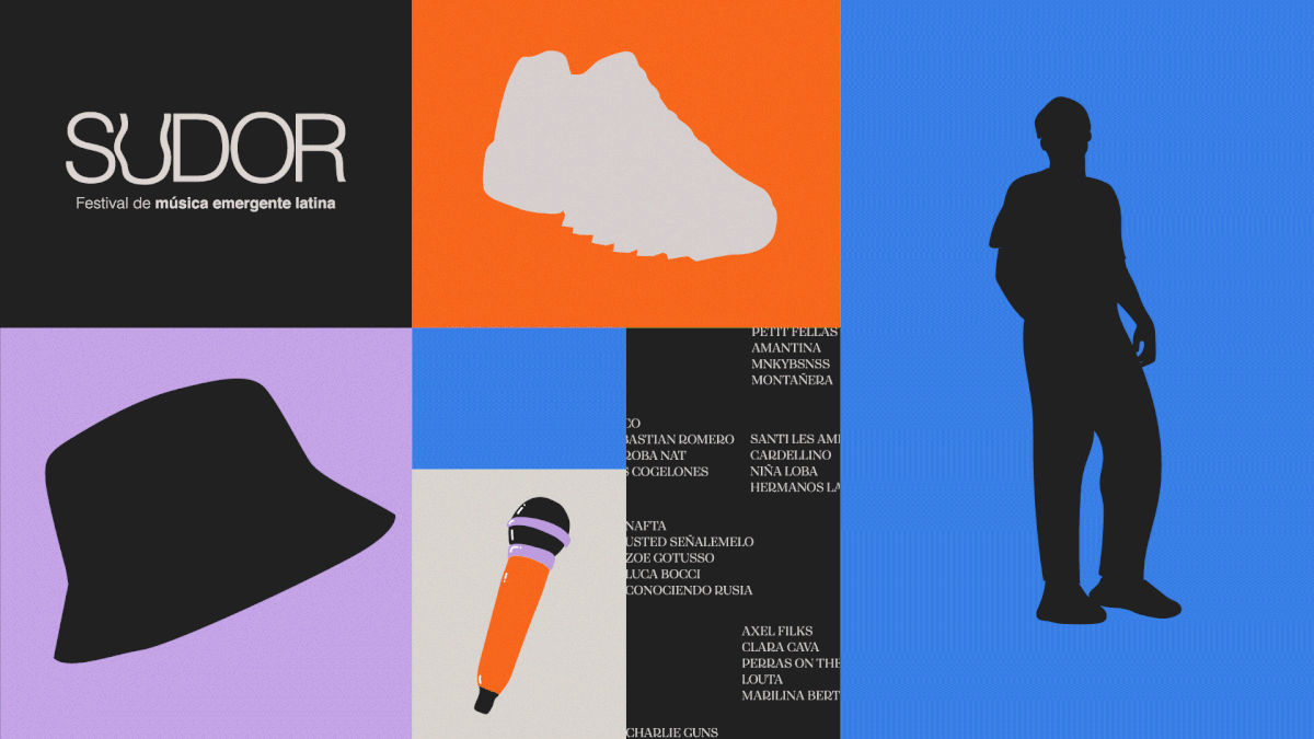
This design employs a bold, modular layout utilizing stark color blocking and strong silhouettes to create a modern, high-contrast aesthetic. The visual language is clean and graphic, effectively separating key information—titles, graphics, and lists—into distinct panels. The overall feel is energetic, contemporary, and suitable for promoting a vibrant music event.