foundation
19 designs
Showing 19 of 19 (19 total)

This design utilizes a sophisticated color blocking technique to create a modern and structured visual identity for the foundation. The strong geometric divisions lend an air of stability and elegance to the overall composition.

This design exemplifies clean, modern minimalism through the strategic use of negative space and precise typography. The visual language is understated yet professional, relying on simple geometric elements to define the text structure.

This design utilizes a striking juxtaposition of clean, modern typography with organic photographic elements, creating a layered and personal visual narrative. The integration of human forms into the text suggests themes of legacy, community, and individual contribution. The overall feel is sophisticated yet deeply human and artistic.

The design is minimalist and sophisticated, utilizing a muted, earthy color palette and strong negative space to convey a sense of professional gravitas. The layout is clean, structured, and relies on subtle tonal variations to create visual hierarchy.

The design is clean, minimalist, and professional, utilizing a simple layout with clear text hierarchy. It employs a subtle color gradient bar to add visual interest while maintaining a corporate or institutional feel.

The design is minimalist and corporate, utilizing a simple geometric mark to represent the organization's name. The visual language is clean and modern, relying on negative space and a monochromatic palette to convey a sense of stability and professionalism.

The design is clean, minimalist, and professional, utilizing a simple layout with ample white space to focus on the text. The visual language is corporate and institutional, relying on a muted color palette punctuated by vertical stripes for subtle branding.

The image features a clean, professional logo mark combining clear typography with a simple, geometric icon. The design relies on strong negative space and high contrast to convey trust and established authority.

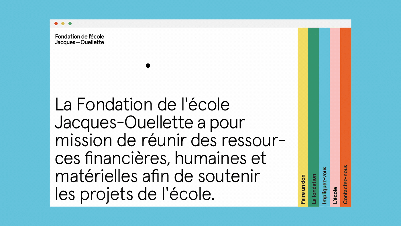
A clean, minimalist institutional website design featuring a French educational foundation. The layout combines bold typography with a structured color-coded vertical bar system, creating a modern and professional aesthetic that emphasizes clarity and organizational purpose.

A minimalist institutional identity system for the Hering Foundation featuring a clean, modern aesthetic with geometric iconography and a restrained color palette. The design employs a grid-based layout with consistent typography and symbolic line-work that conveys professionalism and forward-thinking values.

A minimalist institutional design system for the Hering Foundation featuring a clean, modern visual language with geometric iconography and a restrained color palette. The layout demonstrates consistent branding across multiple card formats with a focus on clarity, hierarchy, and purposeful whitespace.

A cohesive brand identity system for Zantero Foundation featuring six vertical poster variations with bold geometric shapes and vibrant color blocking. The design employs a modern, minimalist aesthetic with striking contrast between solid backgrounds and abstract geometric elements, creating a dynamic and contemporary visual language.

The design features a clean, modern layout using a muted color palette dominated by teal and white, conveying a sense of medical research and hope. The composition is balanced, using photographic elements alongside clear text blocks to communicate a message about future generations.
The design is clean, minimalist, and professional, utilizing a light blue background with clear, structured text and a subtle color bar accent. The visual language is institutional and straightforward, aiming for trust and clarity in communication.

The logo features a stylized, abstract representation of a figure or form integrated with the text 'Mellon Foundation'. The design uses a monochromatic, high-contrast approach with organic, curved shapes that suggest movement or connection.

This is a clean, minimalist logo design featuring bold, sans-serif typography for the initials 'PAN' with smaller accompanying text below. The design conveys a sense of professionalism, structure, and understated authority through high contrast.
The design is minimalist and corporate, utilizing a monochromatic palette against a muted green background. It conveys a sense of stability, foundation, and academic seriousness through clean lines and simple typography.

The design employs a clean, modular grid structure with a muted, nature-inspired color palette dominated by various shades of green and off-white. The visual language is minimalist, relying on strong typography and simple geometric dividers to convey a sense of trust and purpose.

This design exhibits a clean, minimalist aesthetic characterized by ample white space and clear modular organization. The visual language relies heavily on simple geometric shapes and stark contrasts to convey serious, organized information effectively.