institutional branding
15 designs
Showing 15 of 15 (15 total)

This design utilizes a clean, minimalist approach characterized by strong geometric shapes and high contrast typography to convey institutional information. The visual language is highly structured, relying on negative space and precise alignment to create a modern and authoritative feel.

This design utilizes high contrast between stark white typography and a muted, textured olive green background to create a clean and institutional aesthetic. The visual language is minimalist and relies on strong, clear typography to establish a sense of academic authority and contemporary relevance.

The design is clean, modern, and institutional, utilizing a simple geometric logomark paired with clear, sans-serif typography. The visual language is minimalist and professional, conveying a sense of established academic identity.

A minimalist, modernist design system featuring a bold geometric tree icon rendered in white against a vibrant forest green background. The layout employs a clean, grid-based structure with hierarchical typography and icon-driven information architecture, exemplifying contemporary institutional or environmental design standards.
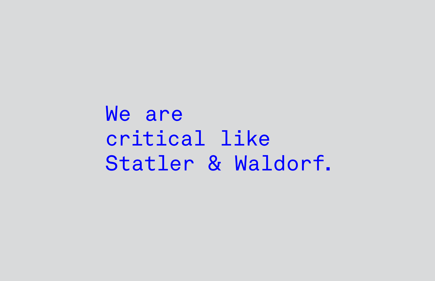
A minimalist typographic design featuring a bold statement in bright blue monospace text against a neutral gray background. The composition emphasizes conceptual messaging with a clean, digital aesthetic that references critical design philosophy and institutional branding.

A grid-based layout showcasing six distinct design cards with varied typography, photography, and color treatments. The composition balances documentary photography with minimalist text-based design, creating a cohesive yet eclectic visual narrative around materials, labor, and industrial design.

A minimalist institutional identity system for the Hering Foundation featuring a clean, modern aesthetic with geometric iconography and a restrained color palette. The design employs a grid-based layout with consistent typography and symbolic line-work that conveys professionalism and forward-thinking values.

A minimalist institutional design system for the Hering Foundation featuring a clean, modern visual language with geometric iconography and a restrained color palette. The layout demonstrates consistent branding across multiple card formats with a focus on clarity, hierarchy, and purposeful whitespace.
A minimalist logo design featuring bold, geometric typography with a distinctive square icon integrated into the wordmark. The design employs a clean, modern aesthetic with high contrast against a neutral beige background, exemplifying contemporary branding principles.

A minimalist academic redesign concept for Yale University featuring a clean, grid-based layout with sophisticated typography hierarchy. The design employs extensive whitespace and subtle blue accents to create an elegant, institutional aesthetic that balances formality with contemporary sensibility.

A striking modular poster series featuring bold geometric silhouettes and minimalist typography, displayed on an industrial wall. The design employs a systematic color-coding approach with stark black shapes against contrasting backgrounds, creating a cohesive yet visually distinct collection that emphasizes clarity and hierarchy.

The design is clean, modern, and professional, utilizing a strong brand identity through geometric shapes and a sophisticated color palette. It conveys an academic or institutional feel while maintaining a contemporary and inviting visual tone.

This set of graphics employs a strong, modern visual language utilizing bold color blocking and negative space to create clear information hierarchy. The design is highly organized, using distinct panels for different announcements while maintaining a cohesive brand identity through consistent typography and limited color pairings.

This design utilizes a sophisticated, minimalist aesthetic combining soft photographic elements with geometric layouts and muted tones. The visual language emphasizes professionalism, trust, and a clean, modern approach suitable for an institutional brand.

This design utilizes a clean, block-based approach with strong color blocking to present information in an easily digestible format. The visual language is minimalist and structured, relying on simple typography and distinct color shifts to separate related concepts.