product development
24 designs
Showing 24 of 24 (24 total)

This design utilizes a stark, minimalist aesthetic dominated by large, bold numbers set against a textured, monochromatic background. The visual language is clean and technical, emphasizing structure and precision through strong typography and clear section labeling.

This display utilizes a high-contrast, vibrant color scheme to convey innovation and clarity. The design is modern and graphic, using bold diagonal lines to draw attention to the core message about product creation. The overall feel is professional, energetic, and forward-thinking.

This is a highly structured and clean visual representation of a design process timeline, effectively mapping various stages from research to testing across a twelve-week period. The visual language is minimalist, relying on clear lines and text hierarchy to convey complex methodological information.

This design utilizes a bright, optimistic yellow palette and strong negative space to convey a message of clarity and environmental focus. The visual language is minimalist, relying on bold typography and subtle abstract lines to support the core theme of sustainable design.

The visual language is clean, modern, and highly professional, utilizing ample white space to emphasize key information. The design relies on strong typography and simple layouts to convey a sense of structured process and expertise.

This image presents a highly technical and minimalist design study, focusing on product details and brand integration through precise line drawings. The visual language is clean, structured, and emphasizes engineering accuracy while maintaining a strong, modern aesthetic.

The image presents a clean, minimalist design focused on branding and surface alternatives, utilizing strong vertical alignment and high contrast between dark green/black and white space. The overall feel is professional, technical, and modern.

The image features an abstract, interconnected geometric design rendered in vibrant, translucent shades of green and pink/orange. It conveys a sense of dynamic movement and complexity through overlapping, sharp-edged shapes.

The image uses a clean, modern, and abstract geometric design to illustrate a process flow. It employs vibrant, contrasting colors within distinct shapes to guide the viewer's eye sequentially through the stages of a creative process.

A comprehensive design framework infographic presenting a strategic methodology through five sequential phases (Empathize, Define, Ideate, Prototype, Test) with color-coded cards and supporting documentation. The layout combines a horizontal timeline visualization with detailed goal descriptions and framework information, using a clean, modular design system that emphasizes clarity and process flow.

The image presents a clean, structured infographic detailing a design process using a numbered, step-by-step flow. The visual language is minimalist and professional, relying heavily on solid color blocks to delineate distinct phases of work.

The image presents a clean, minimalist representation of a user flow or process, likely related to marketing or product development testing. It uses soft colors and simple shapes to convey a progression from leads to analysis.

The image presents a clean, minimalist mobile app or web interface design featuring stark white space and high-contrast black typography. The layout is structured with clear information hierarchy, using large numbers to highlight key metrics effectively.
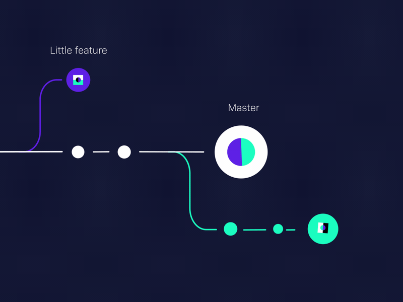
The image presents a minimalist, line-based data visualization or process flow diagram against a dark background. It uses simple geometric shapes and thin lines to illustrate a progression from a 'little feature' to a 'master' concept, suggesting simplicity and clarity.

The image presents a clean, minimalist research phase overview using a muted, monochromatic color palette. The design relies heavily on simple geometric shapes and clear data visualizations to convey findings about user challenges, resulting in a professional and objective feel.

The image presents a clean, minimalist profile or introductory text block with a stark white background, suggesting a professional and modern digital presence. The layout is straightforward, focusing entirely on the biographical text and accomplishments.

The image presents a clean, minimalist presentation slide with high contrast between dark and light elements. The design is structured linearly, using a vertical line to separate two distinct phases of a process (Research and Design), conveying professionalism and clarity.

The design is clean, modern, and professional, utilizing a bright yellow accent against a dark background to create high contrast. It employs a card-based layout with clear iconography and strong typography to guide the user through product categories.

The design employs a stark, minimalist aesthetic characterized by high contrast between dark neutrals and warm, vibrant accents. The visual language is clean and corporate, emphasizing precision, modern functionality, and high-end digital product presentation.

This presentation showcases minimalist furniture design emphasizing clean, rectilinear forms and the interplay between solid materials and shadow. The visual language is restrained yet substantial, focusing on texture, geometry, and muted earth tones to create a sense of quiet permanence.

This slide presents analytical data in a clean, modern format, utilizing clear segmentation and standard bar visualization to communicate statistical findings effectively. The design is highly functional and prioritizes data clarity over elaborate decoration.

This is a clear and structured data visualization using concentric circles to represent components of a product. The design effectively uses color coding and percentage callouts to convey complex compositional data in an accessible manner.

This image is a detailed technical illustration or blueprint showing the assembly and components of an electronic device. The visual language relies heavily on clean, precise line work to convey spatial relationships and functional structure.

This is a highly structured, technical data visualization using a grid system to compare material properties and sustainability metrics. The design is clean, minimalist, and emphasizes clear segmentation of information across different material types.