data_visualization
23 designs
Showing 23 of 23 (23 total)
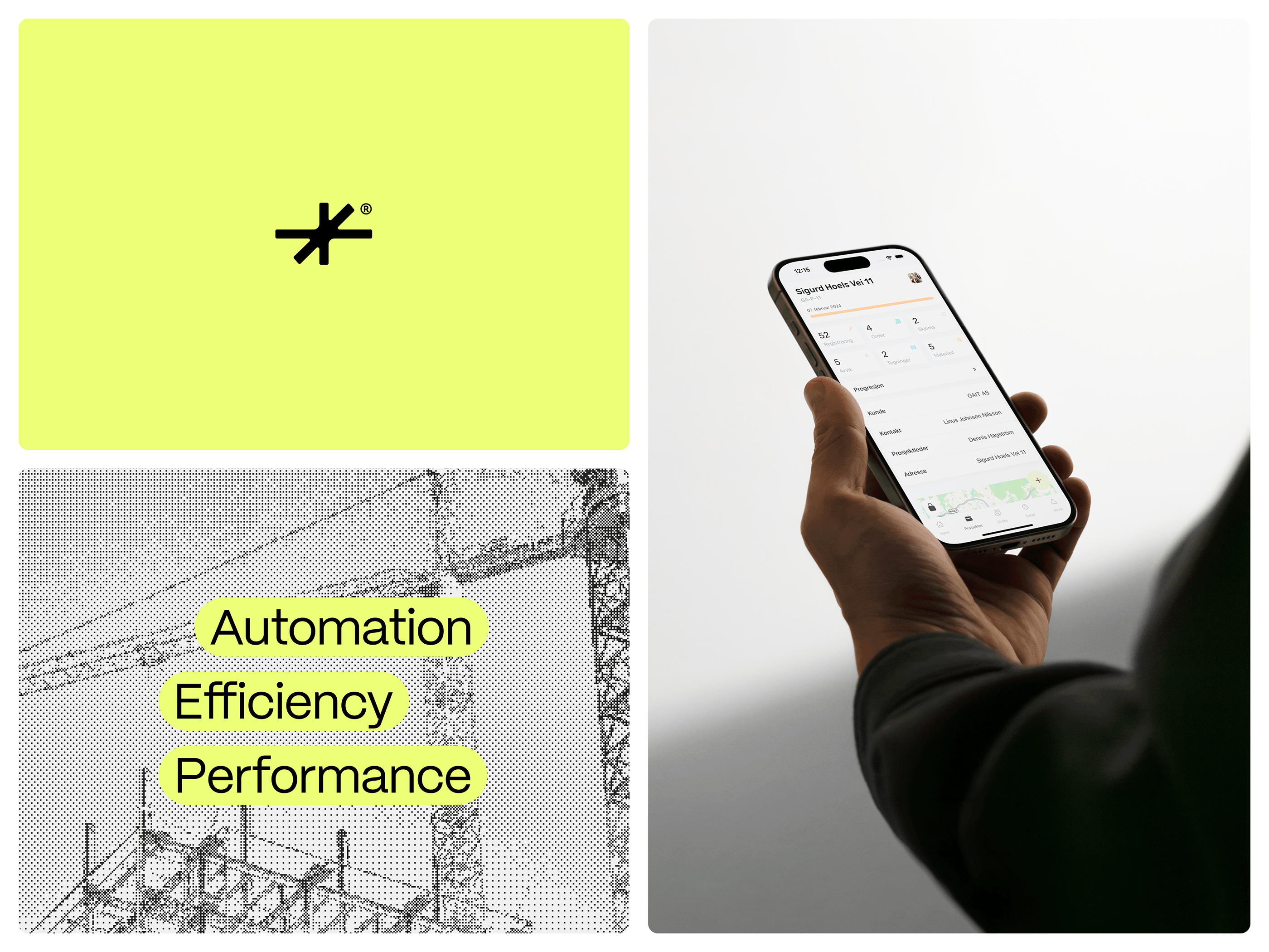
This visual composition effectively juxtaposes abstract concepts (technical schematics and metrics) with modern digital user interfaces, creating a clean, analytical, and high-tech aesthetic. The design uses strong color blocking and clear typography to communicate themes of optimization and performance.
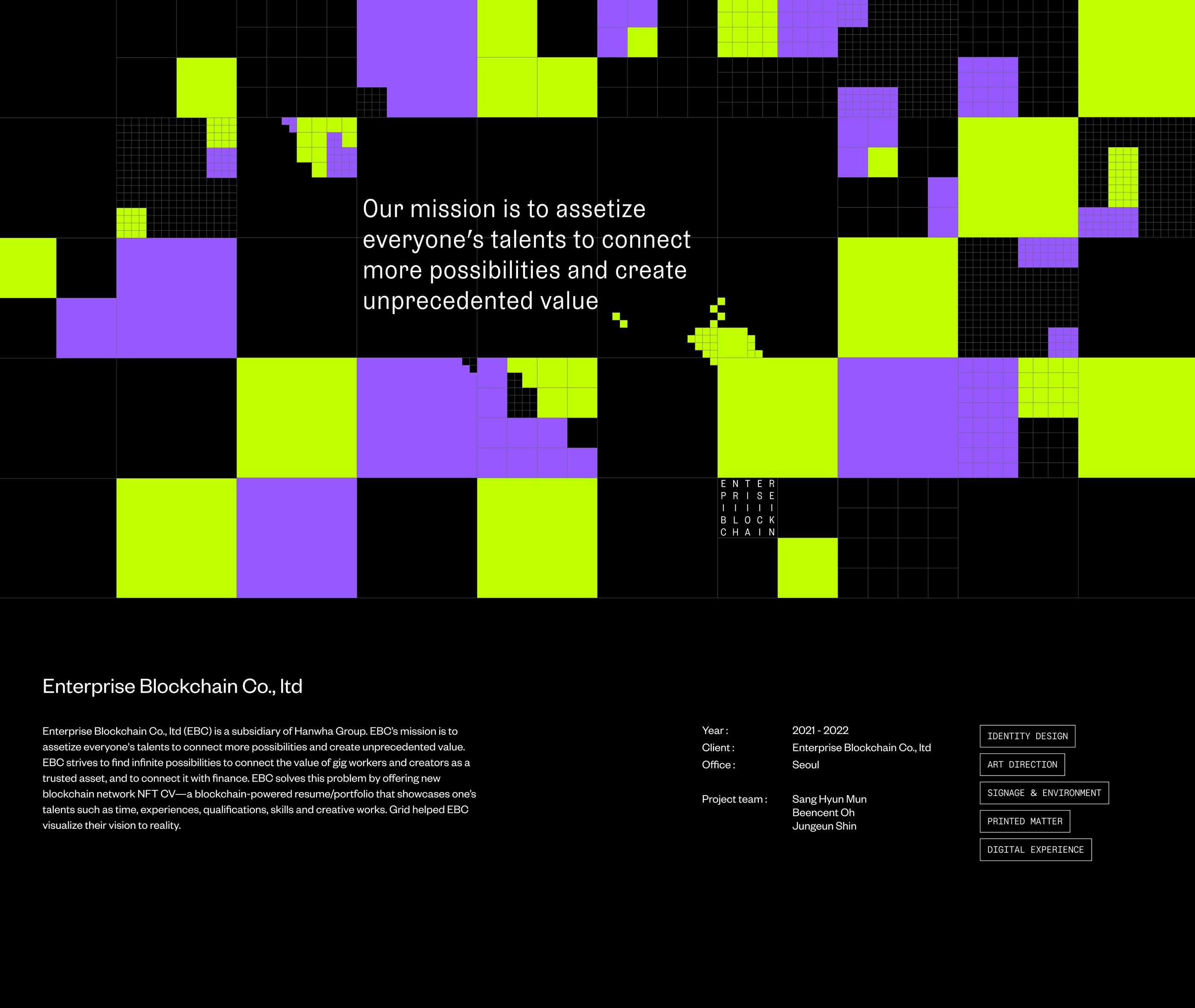
The image presents a highly abstract, grid-based visual structure dominated by contrasting blocks of neon yellow and purple against a dark background. The design suggests data visualization, network mapping, or abstract digital architecture with a clean, modern, and somewhat futuristic feel.
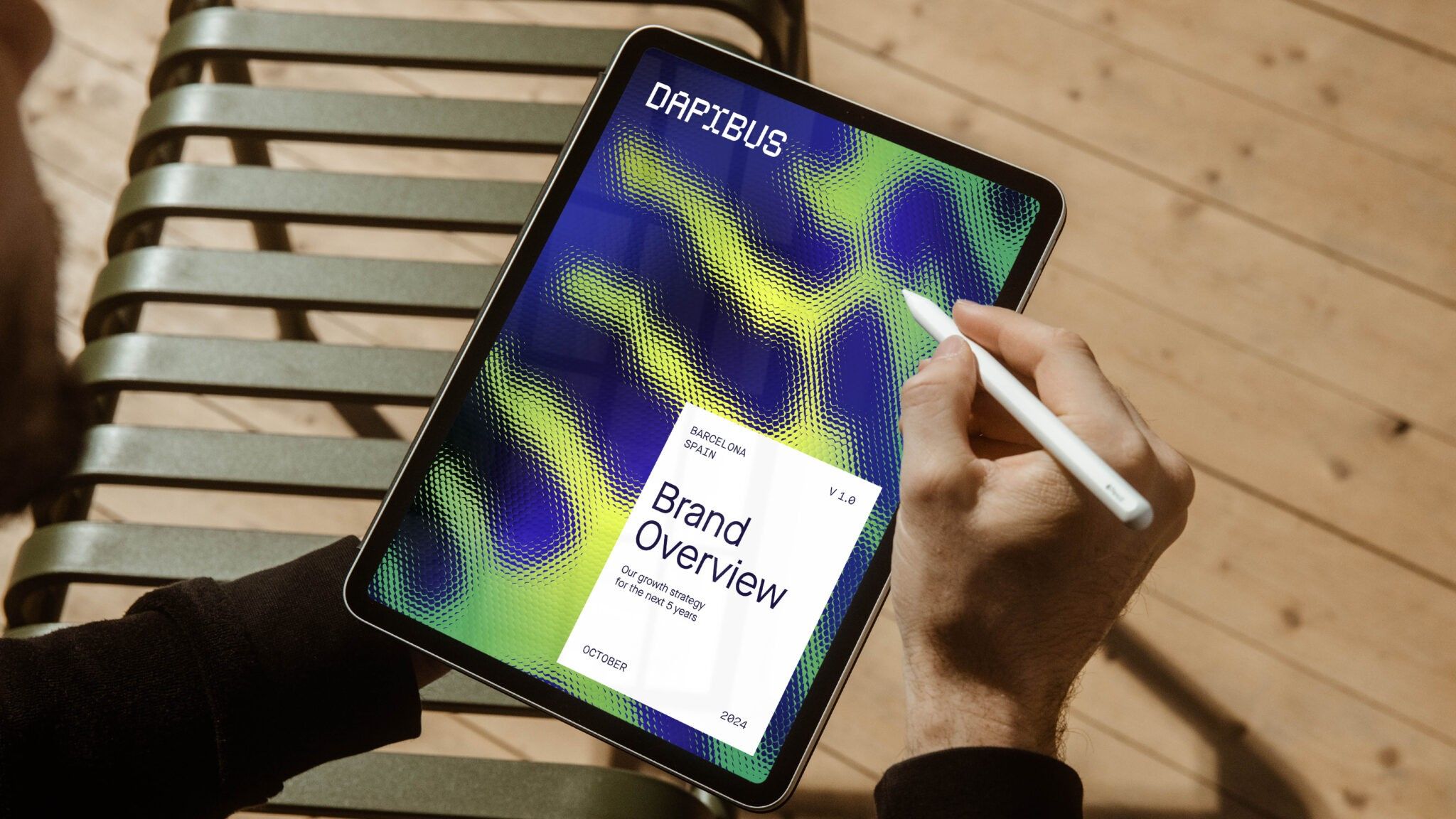
The image showcases a digital interface on a tablet, featuring a vibrant, abstract background pattern overlaid with white text and a handwritten annotation, suggesting a professional or analytical review process. The design balances bold color gradients with clean typography to present complex information in an engaging manner.
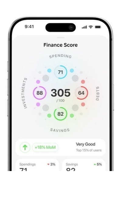
The design presents a clean, modern mobile interface focused on displaying a financial score through a circular visualization. It uses a light background with vibrant, yet soft, accent colors to guide the user's eye toward key metrics and performance indicators.
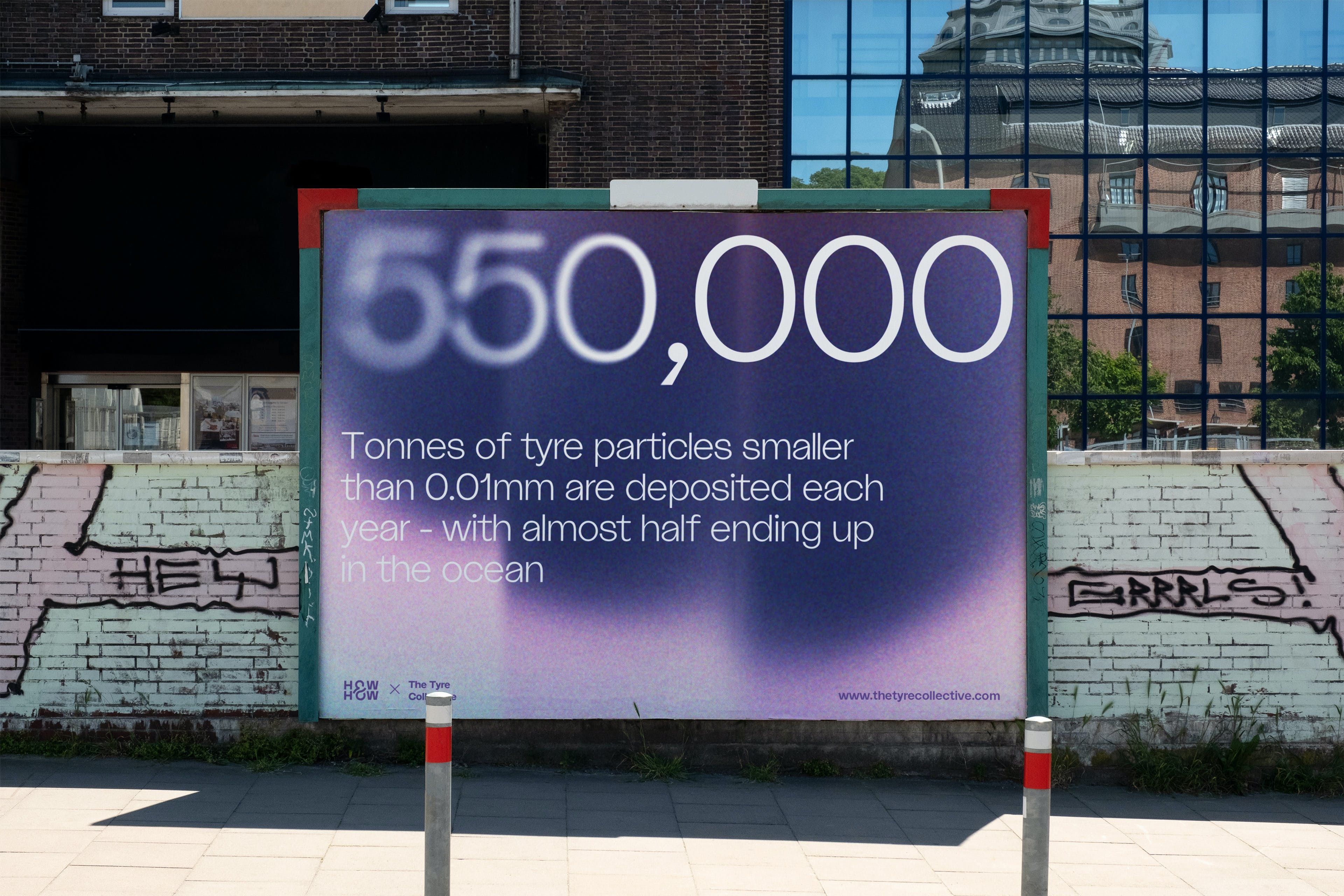
The image features a large, informational sign with bold statistics set against a muted background. The design is clean and direct, utilizing strong contrast between the white text and the deep purple/blue gradient to convey scientific or environmental data.
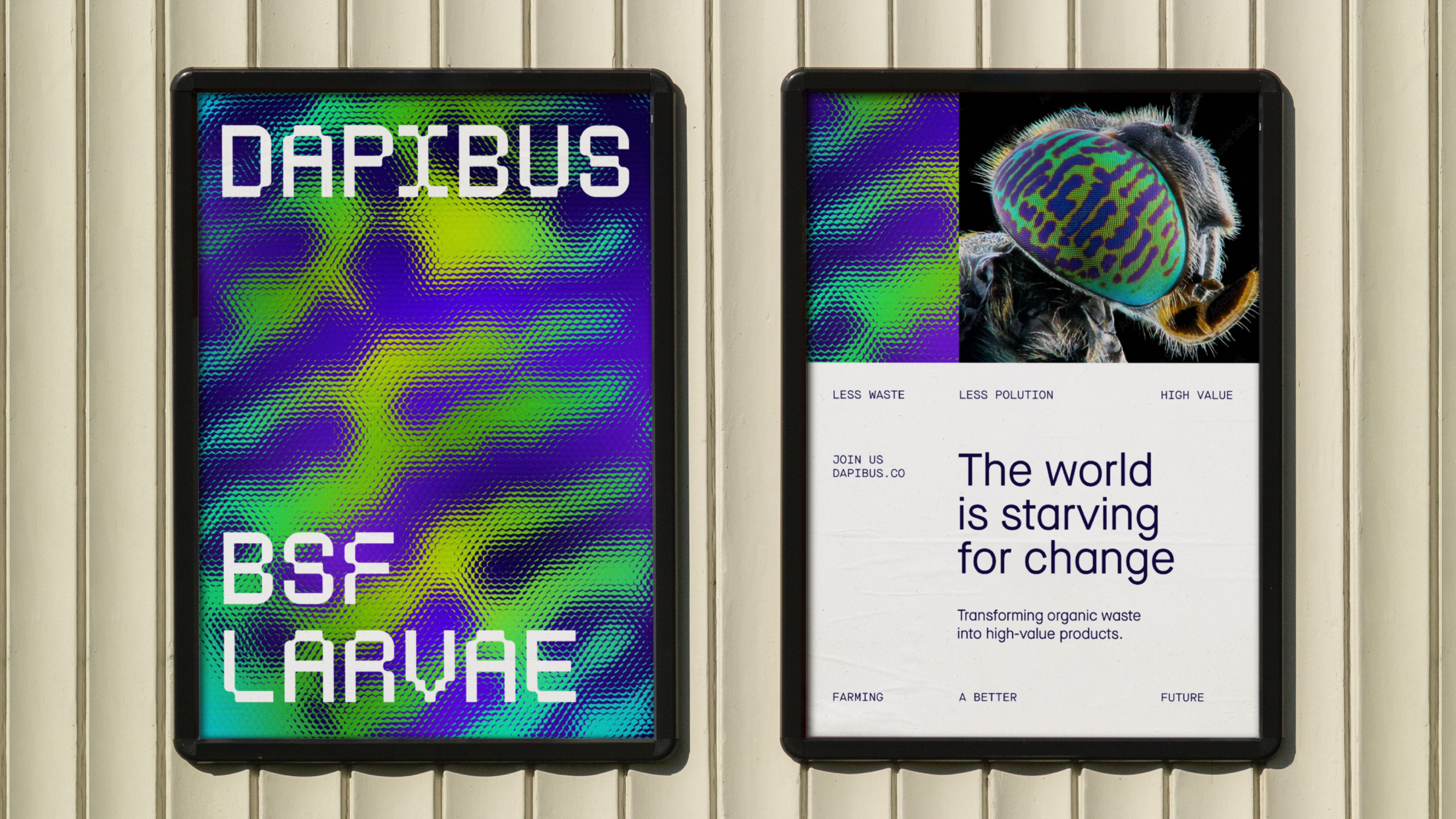
The image presents a stark, high-contrast digital interface design characterized by vibrant, neon-like patterns against dark backgrounds. The visual language is modern and technical, utilizing bold typography to convey specific concepts related to a project or initiative.
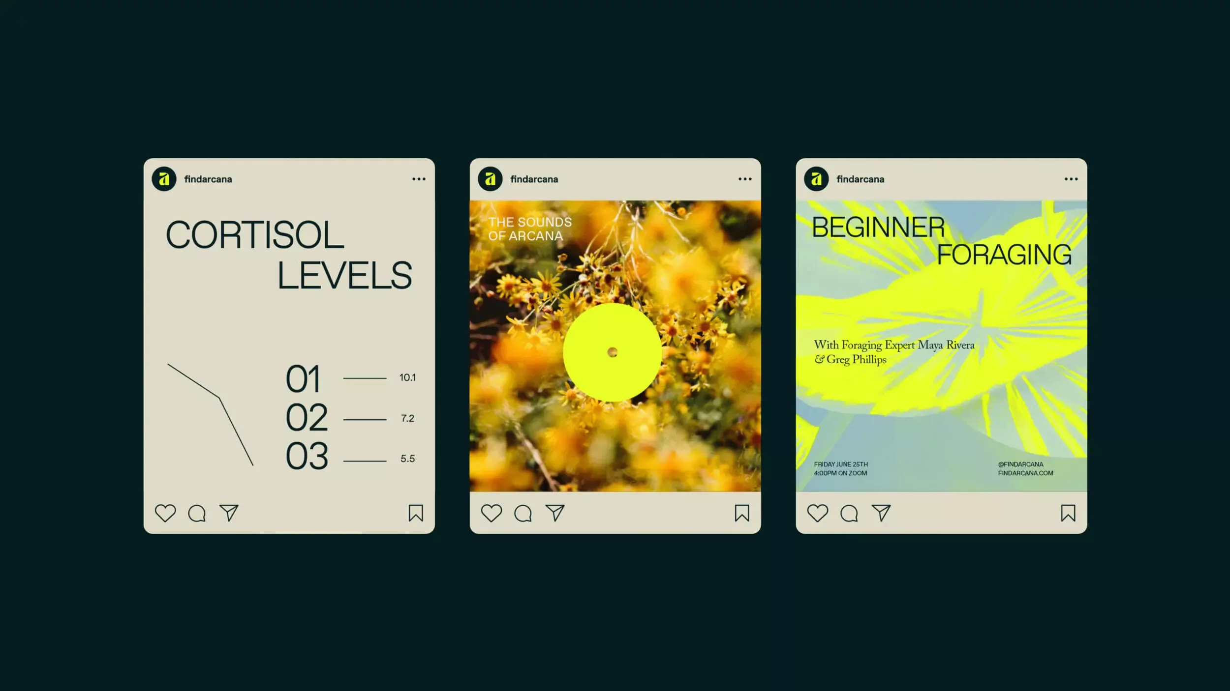
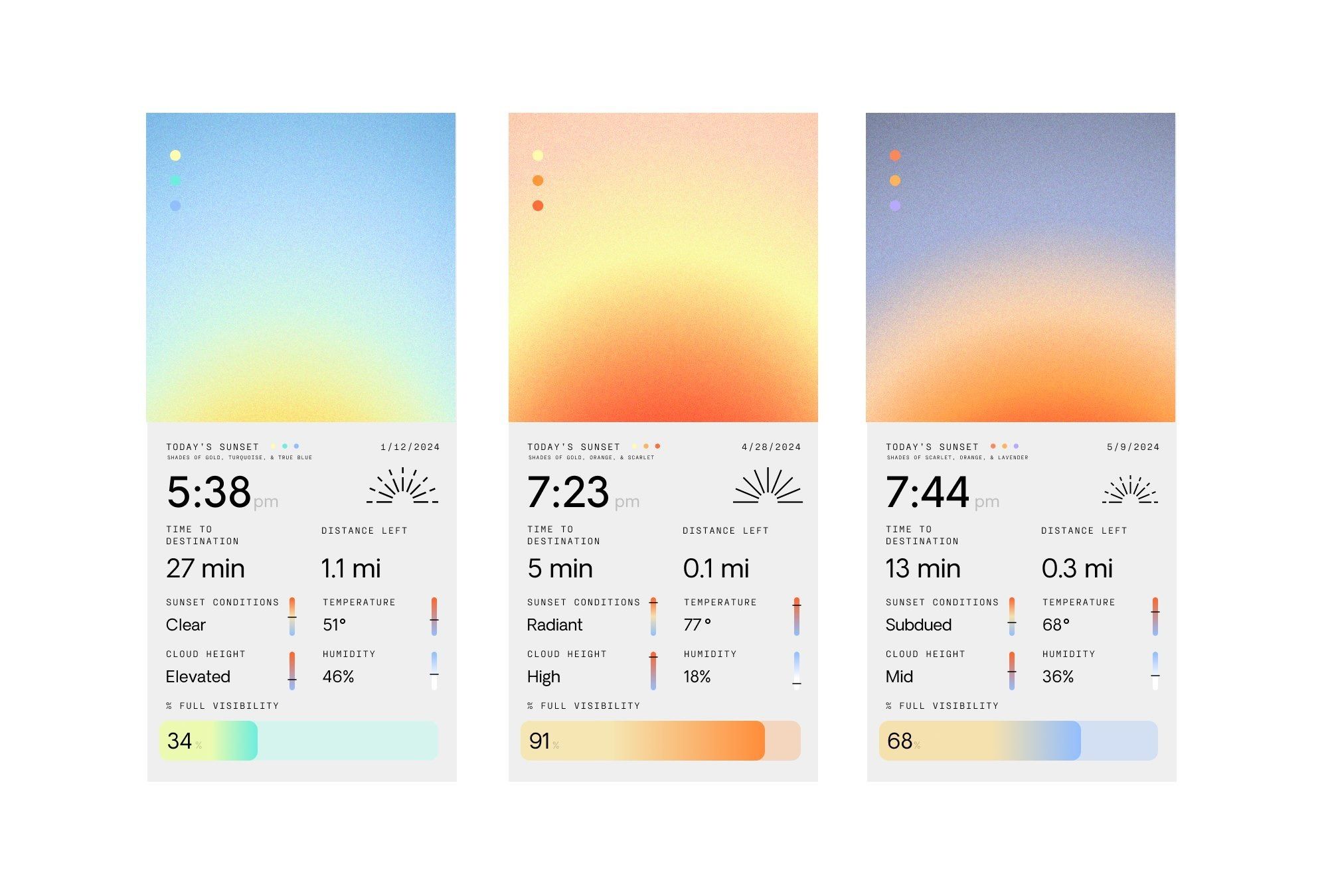
The image displays a set of three minimalist, card-like interface mockups against a dark background, suggesting a clean, modern data visualization or educational app. The design relies heavily on negative space and a limited, muted color palette to convey information clearly.
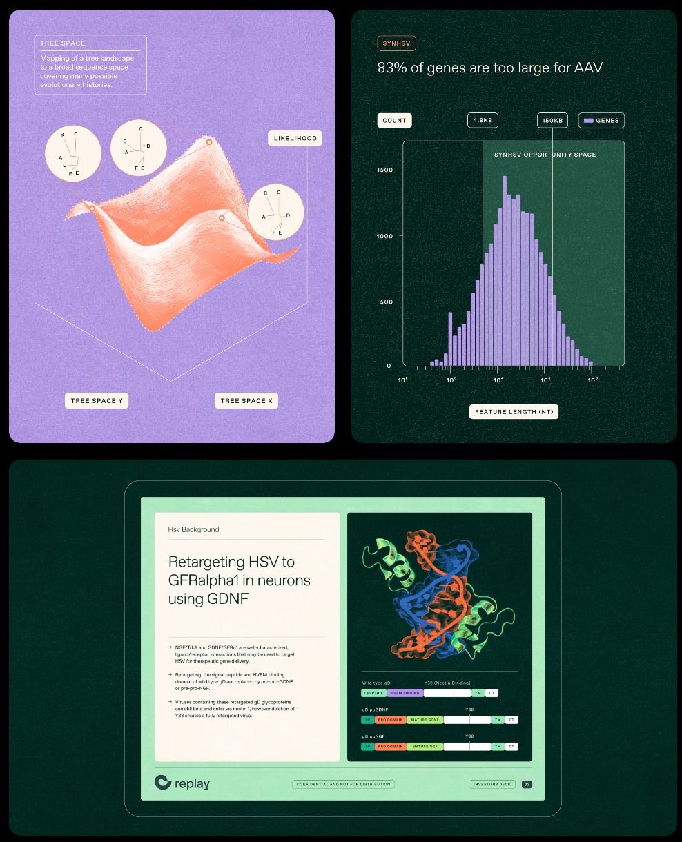
The image presents a collection of distinct visual elements, mixing abstract scientific diagrams with clean, modern UI mockups. The design balances complex data visualization (like the probability distribution) with structured software interfaces, suggesting a focus on bioinformatics or advanced data science.
The image presents a clean, modern interface design overlaid onto a natural landscape, emphasizing data presentation with a muted, organic aesthetic. The visual language is minimalist and functional, blending digital information seamlessly with the surrounding environment.
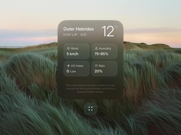
This image displays a clean, modern interface design for a weather application, characterized by soft gradients and clear data presentation. The visual language is minimalist yet inviting, using subtle color transitions to convey atmospheric conditions.
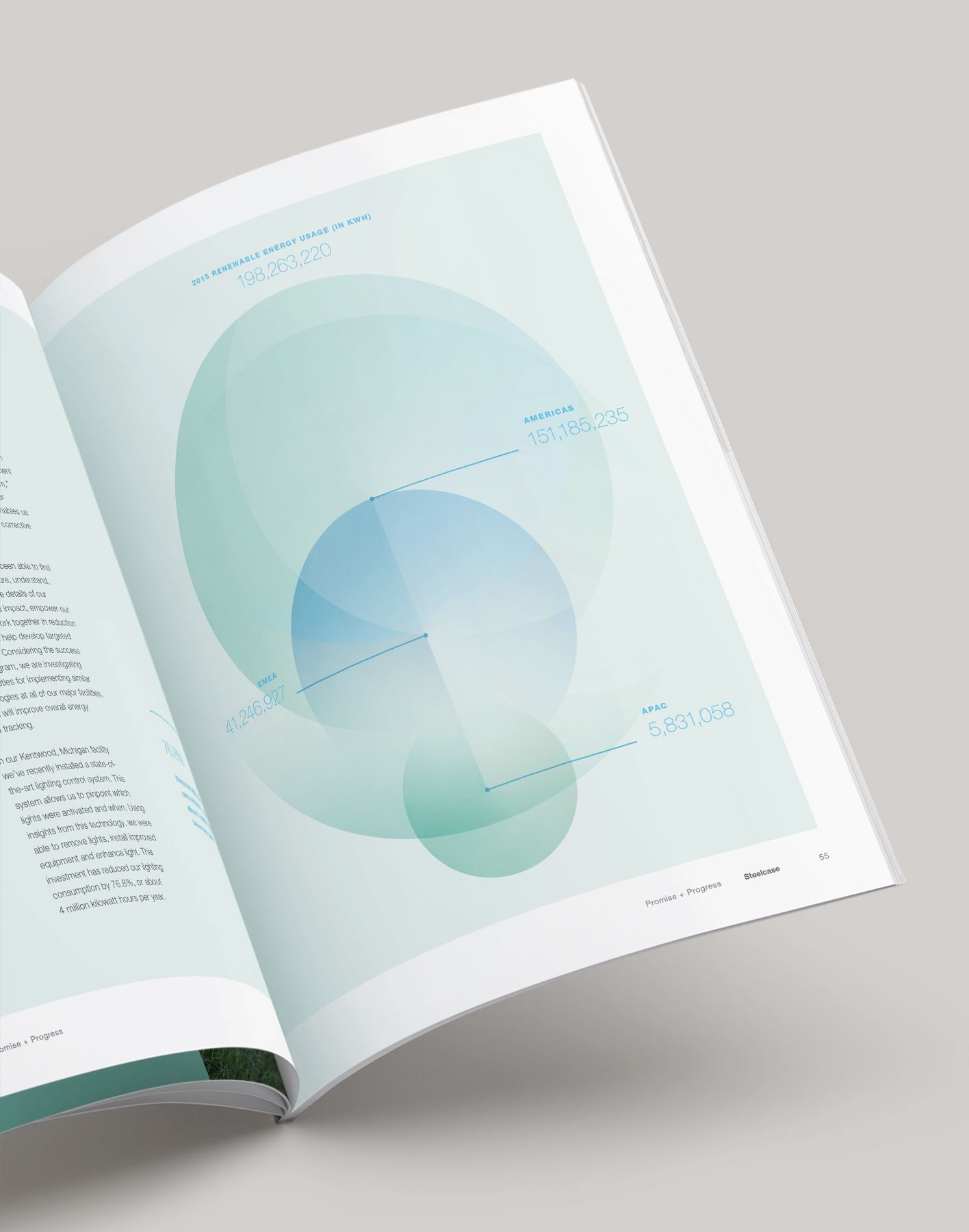
The design features a clean, modern aesthetic dominated by soft gradients and overlapping circular shapes, creating a sense of depth and subtle movement. The visual language is minimalist yet sophisticated, relying heavily on negative space to guide the viewer's eye through the data visualization.
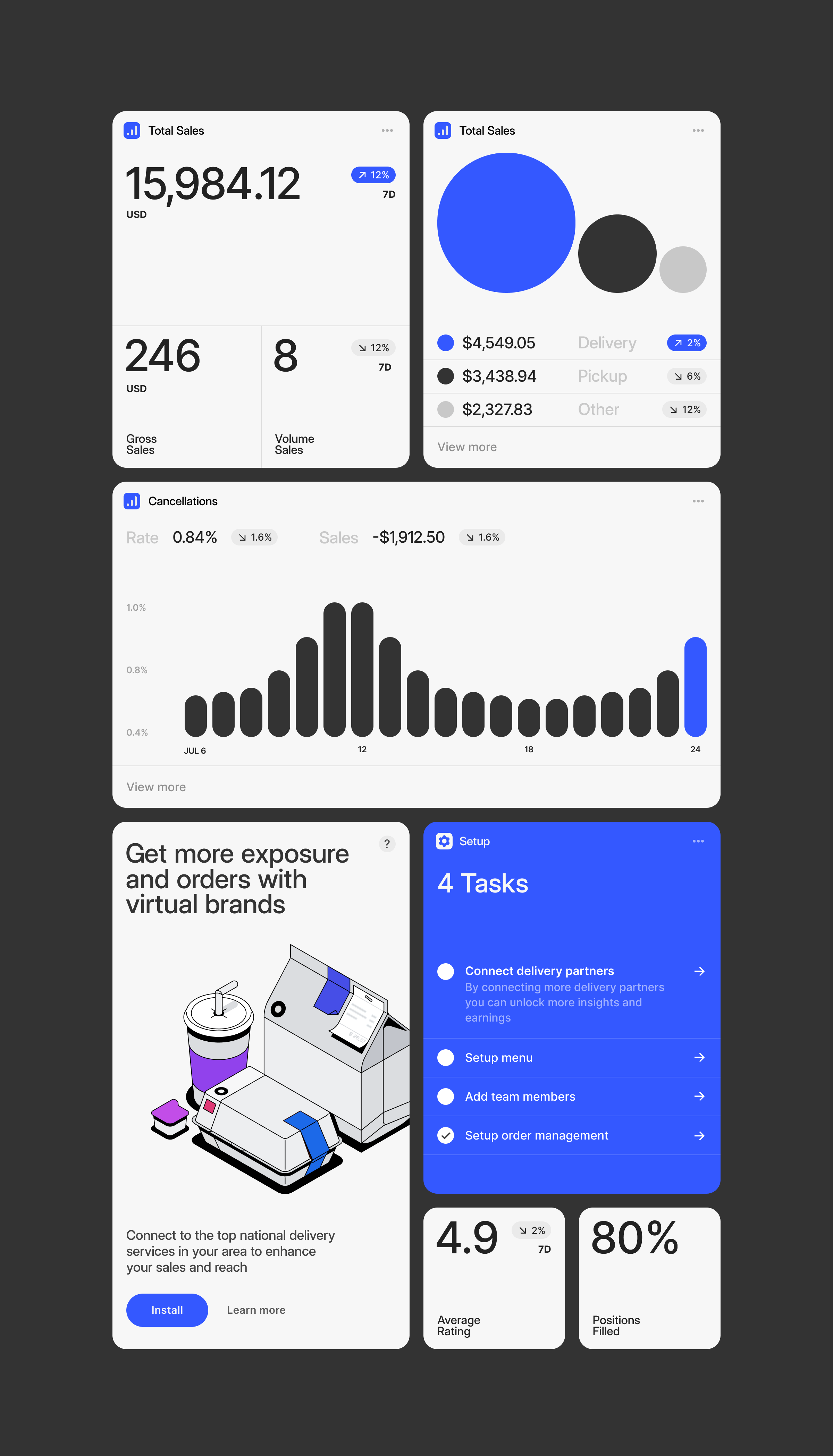
The image displays a clean, modern user interface design, likely for a business or analytics application. It utilizes a card-based layout with clear data visualizations like donut charts and bar graphs, emphasizing readability and professional functionality.
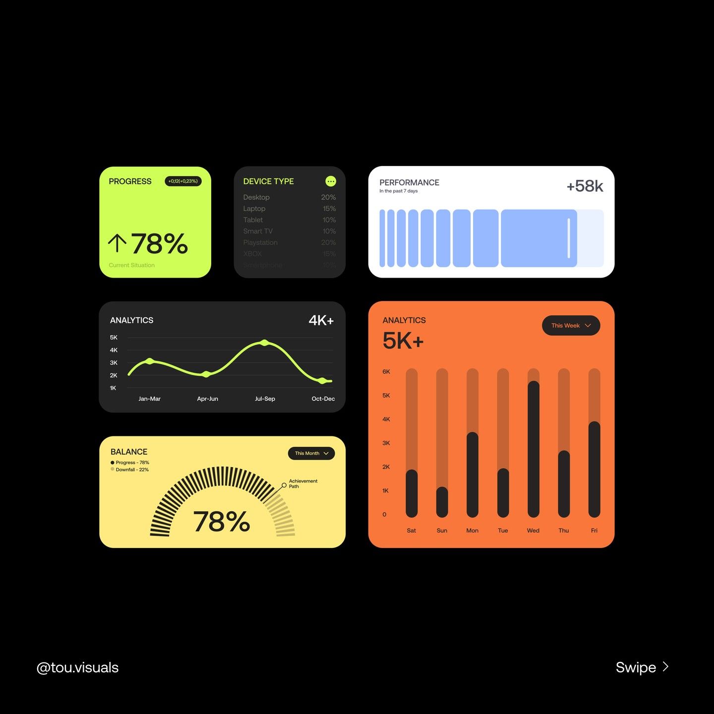
The image presents a clean, modern dashboard interface characterized by distinct card-based components and clear data visualization elements. The design utilizes a limited, professional color palette with strong use of muted greens, blues, and warm oranges to convey progress and performance metrics effectively.
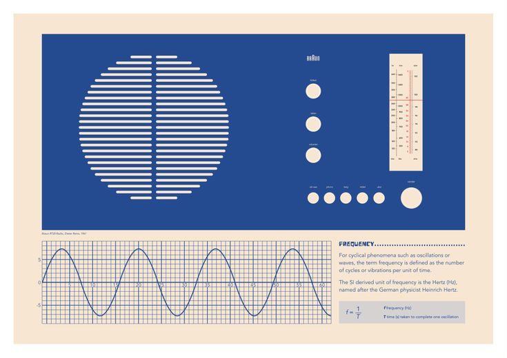
The image presents a clean, minimalist data visualization or infographic style using a deep blue background and white line graphics. The design emphasizes structure, precision, and scientific measurement through geometric patterns and wave representations.
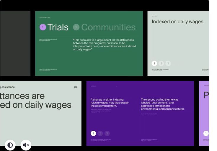
The image displays a clean, modern presentation style typical of a research or findings report, using a muted green and purple palette to segment different topics. The layout is structured with distinct cards or sections, emphasizing clear hierarchy and readability.
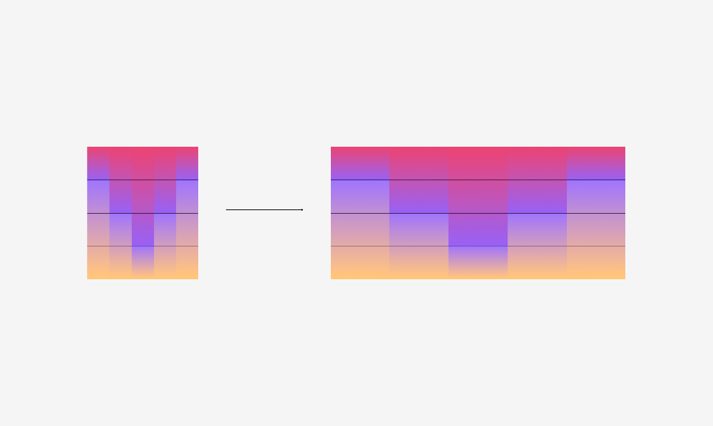
This visualization uses smooth color gradients and horizontal bars to represent a transformation or comparison between two states. The design is clean, abstract, and relies heavily on color transitions to convey underlying data or magnitude.
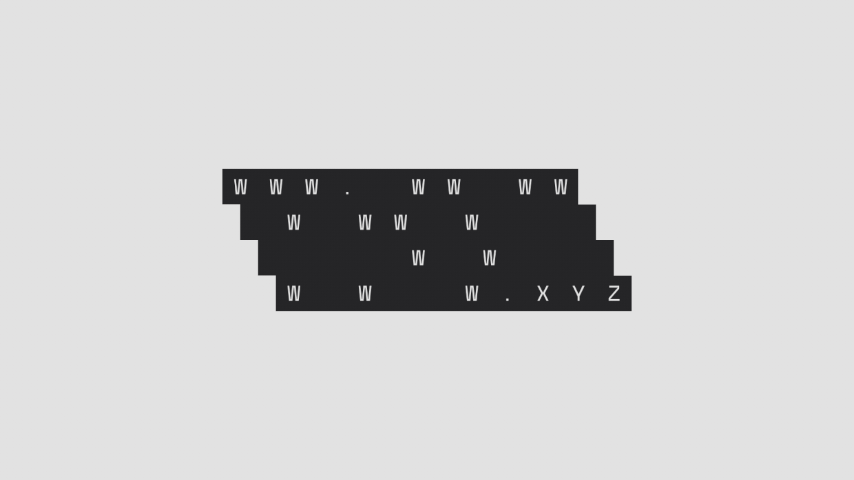
This is a minimalist typographic display featuring alphanumeric characters arranged in stacked, staggered rows against a neutral background. The design utilizes stark contrast and repetition to create a structured yet sparse visual pattern, emphasizing information or data.
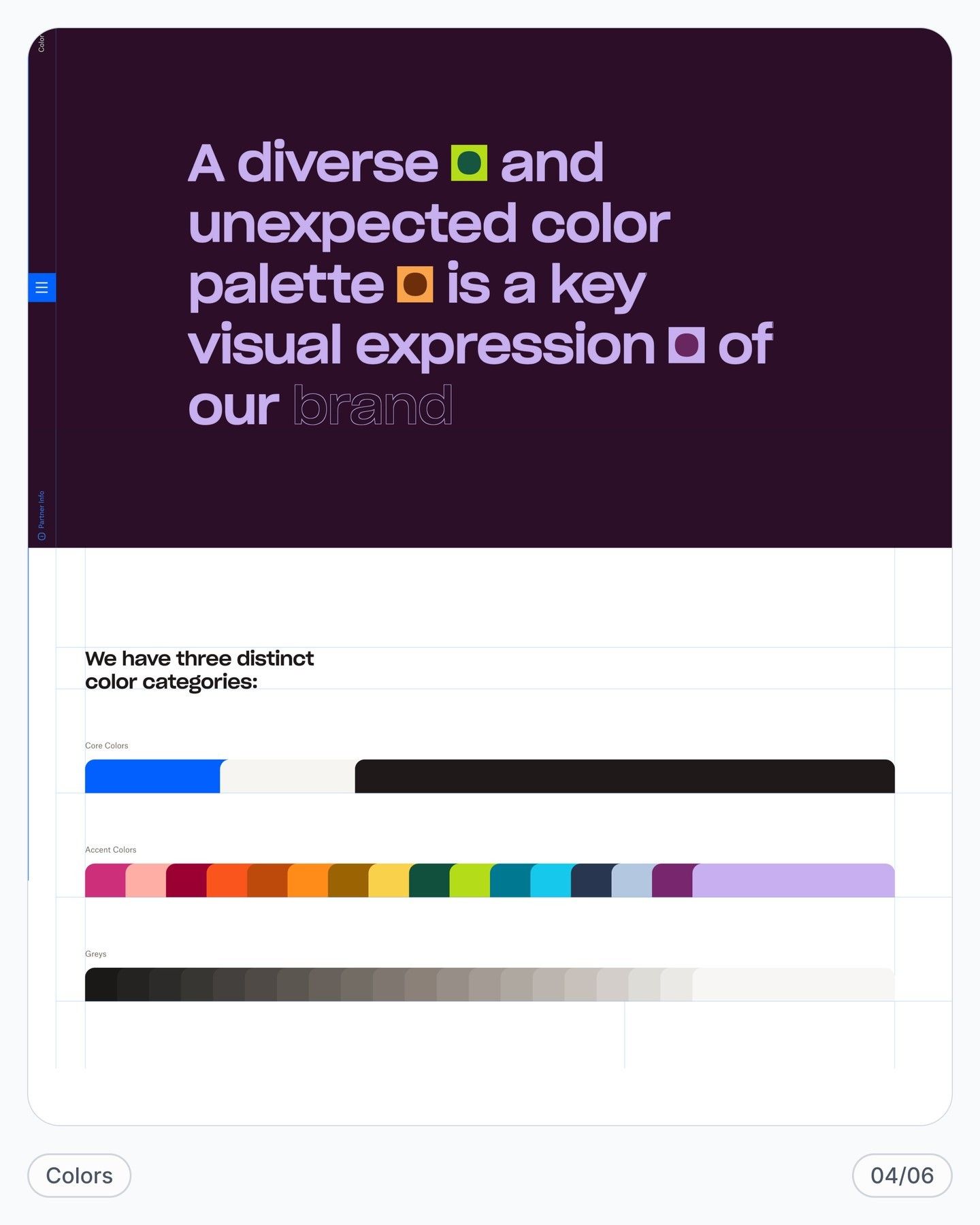
This visual is a clean, modern presentation demonstrating the brand's commitment to color diversity through data visualization. The design uses high contrast between a deep background and bright accent colors to make the branding statement impactful and readable.
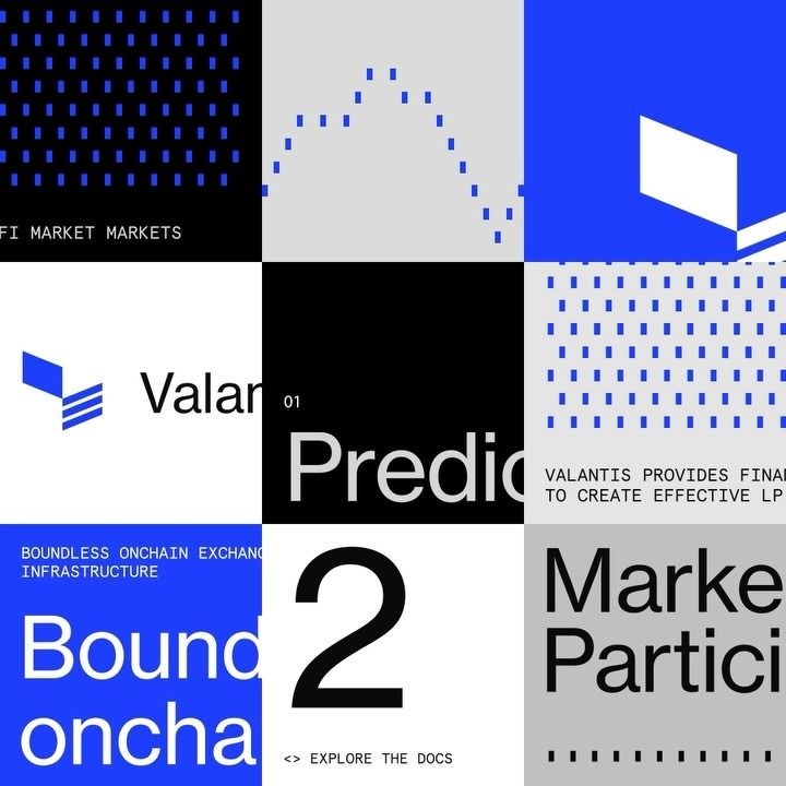
This design utilizes a stark, high-contrast color palette of blue, black, and white within a modular grid structure to present complex financial concepts. The visual language is clean and modern, relying on simple geometric shapes and data visualization elements to imply precision and analytical depth.
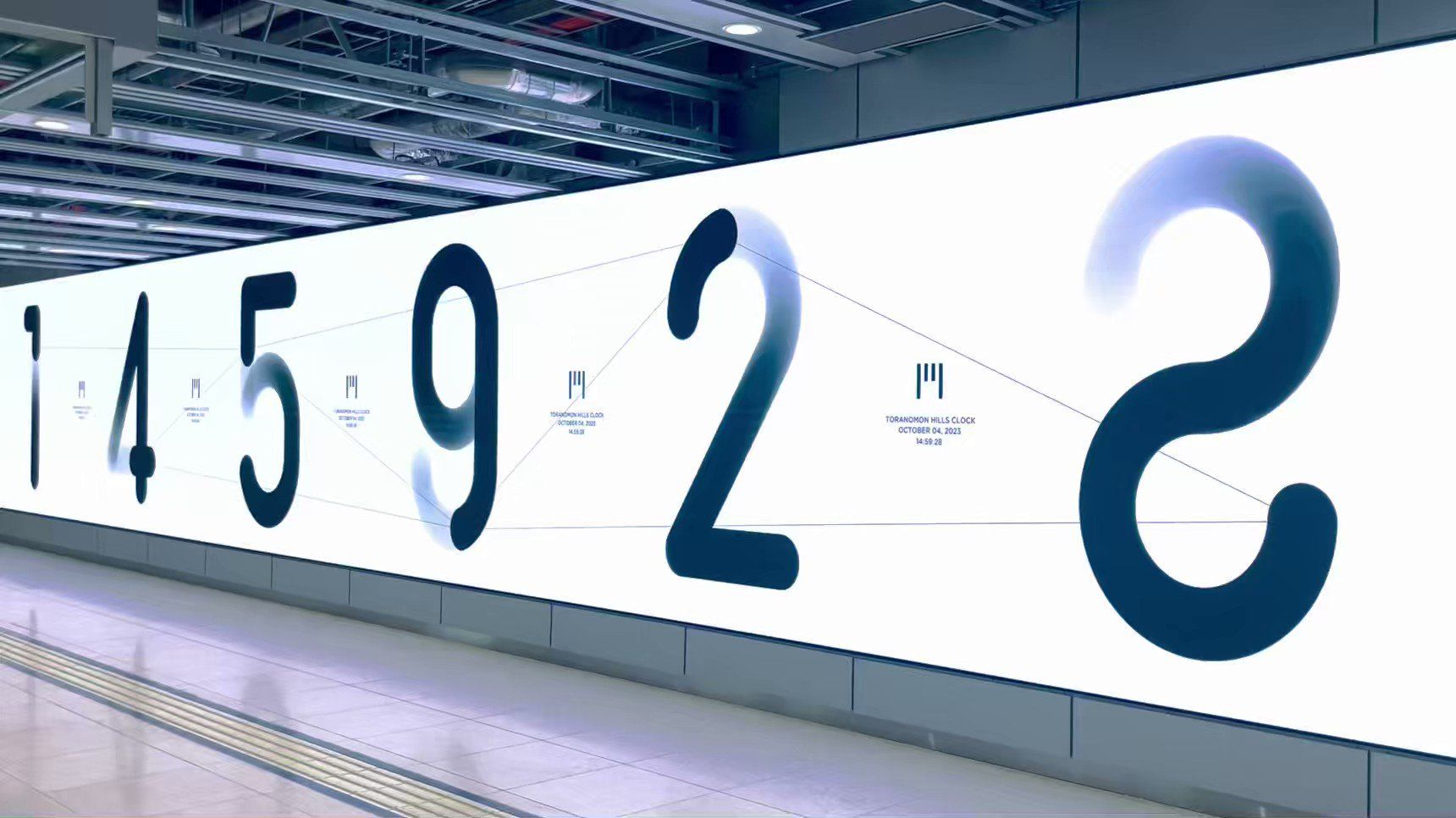
This design features a large-scale, minimalist data visualization utilizing custom, flowing typography to display a numerical sequence. The visual language emphasizes clean lines and negative space, creating an elegant and modern presentation of information.
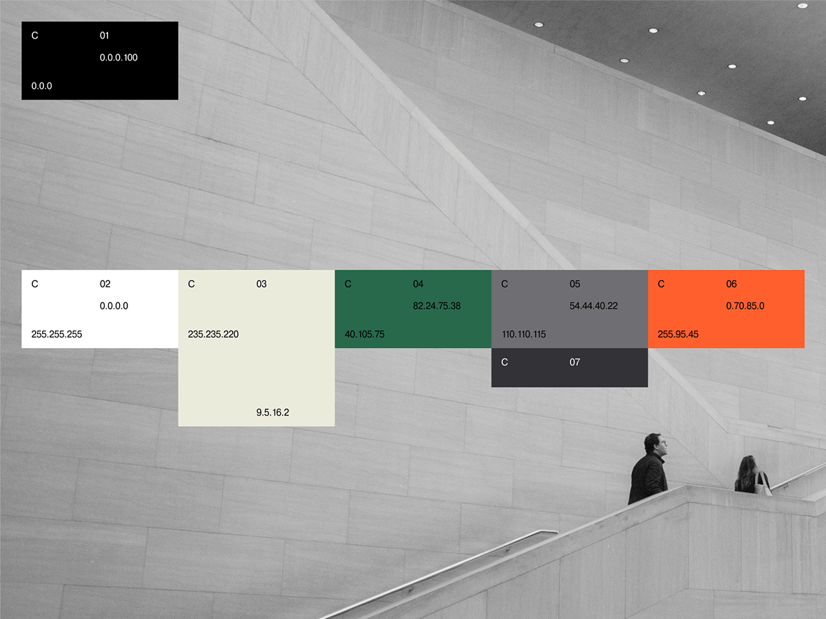
This image presents a stark contrast between a minimalist, modern architectural background and overlaid technical data visualizations. The design effectively combines clean lines, structured boxes, and numerical information to create a precise and analytical aesthetic. The overall visual language emphasizes clarity and the presentation of complex data in an organized manner.
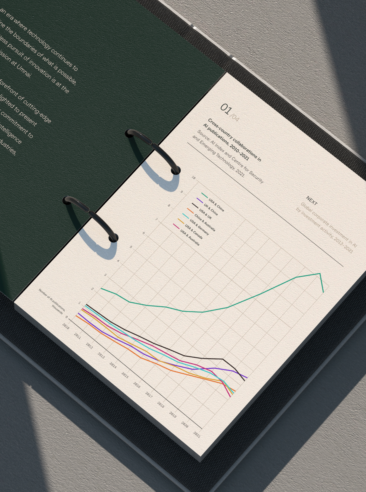
This design utilizes a minimalist and professional layout, effectively presenting complex data through a clean line graph on a dark background. The visual language is precise and analytical, emphasizing clarity and readability for technical reports.
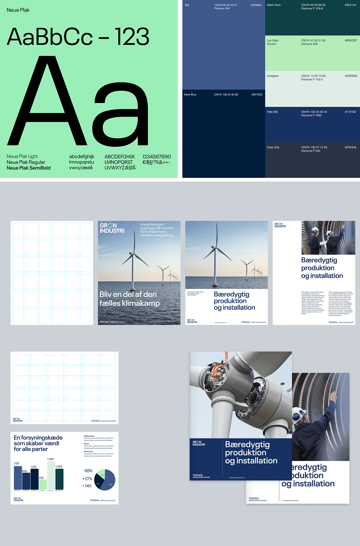
This collection showcases a professional, corporate design language characterized by strong typographic hierarchy and clean data visualization. The visual language balances stark minimalist typography with thematic imagery related to industry and sustainability, resulting in a trustworthy and precise aesthetic.