measured
4 designs
Showing 4 of 4 (4 total)

This is a data visualization presenting monthly inflation rates for used cars and trucks, adjusted for the prior month, spanning from January to September. The design uses a simple bar chart format with distinct color coding for different data series.

This is a clean, data-driven bar chart presenting clinical trial results for a drug named 'Parable'. The design is minimalist, relying heavily on dark brown bars against a light background to clearly convey quantitative comparisons across various metrics.

The image is a conceptual diagram illustrating a spectrum of possibility or desirability, moving from 'NOW' to 'POTENTIAL', with intermediate states labeled as 'PROBABLE', 'PLAUSIBLE', and 'PREFERABLE' leading towards 'POSSIBLE'. It uses a linear, cone-like visual metaphor to map subjective or objective states across a continuum.
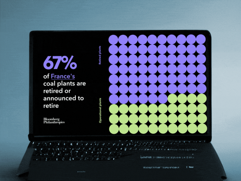
This design employs a clean, minimalist visual language typical of data journalism, using color blocking and a grid to convey statistical information clearly. The layout is highly organized, emphasizing the stark contrast between the dark background and the vibrant, segmented data points.